UX Design Exercise — Pet Locator

Context — Background Info
The pet industry has been experiencing exponential growth for a while now, and with the current situation of the pandemic, many people are spending much more time at home that there has been a surge in demand for ‘pandemic pets’ as described by CTV news, as many are looking for companions to keep them company during self-isolation. Statista also shares some interesting facts reporting that there are now more-pet owning households than there are those with children which comes with an estimated total expenditure of $99.0 billion dollars for the pet industry in 2020, and that’s only counting for the U.S household market.
“As COVID-19 shuts down workplaces and schools, many Canadians find themselves with enough time to welcome a new pet into their lives, either permanently or as a temporary foster.”
American Pet Products Association (APPA) also remarks that millennials make up the largest group of pet owners in the U.S and claims ‘it is imperative to understand their behaviour as pet parents and pet product consumers’ as they are on their way up in terms of income and spending”. Understandably pet owners see their pets as family and care for them as much as they would any other member of their personal relatives.
Clearly the market looks very promising and opportunities for growth are always there. Introduction of products to bring the pet experience closer to the pet owner would allow business to tap into the biggest pet trends in today’s times both looking to bring new features or enhance current applications.
Project Brief— What does the digital experience allow the user to do?
This digital application along with the paired smart collar would allow users to know vital metrics about their pets for example step count, distance traveled, calories, heart rate, time active and sleep quality to name a few. The one feature we are looking to explore in this challenge is getting the location of the pet in case they become lost and separated from their owner. This is a major issue with many pet and pet owners which I discuss in our problem statement.
Problem Statement — What are we trying to solve for?
According to American Humane, approximately 10 million pets are lost in the United states every year and many of these are never recovered by their owners. That’s 1 out 3 pets that become lost at some point in their lifetime.
They estimate only 15 percent of dogs and 2 percent of cats in shelters without ID tags or microchips are reunited with their owners which is a surprising and unfortunate number.
PetFinder.com states many pet owners decide to microchip their pets which has helped the return-to-owner rates increase to 52 percent, and looking at the grand picture is still a low number of pets that make it back safe to their owners. Although this is a step in helping owners be reunited with their pets, I believe there are other safeguards to prevent pets from getting lost including the smart collar.
Outlining the process:

Before we move ahead with the problem statement and begin our research, I want to go over the steps I like to take in order to find a solution to our initial problem. I divide my work into four primary phases and dive deeper into each phase every step of the way. The Research Phase we begin by laying down some fundamental knowledge we have about the subject and clearly stating what the problem statement is. We need to be able to recognize why we are building this and what problem we are trying to solve.
This leads us to the User Research Phase to identify our target audience and what the steps may look like from an user’s perspective to get through the problem. This we also take into consideration what the user’s needs and expectations are which will allow us to explore how this problem may find a solution. We need to ask questions like who are we designing for? and, what are the current issues?
Having done research for both of the users and the product, the next phase, the Design Phase is where we begin by putting that knowledge into a mock-up followed by our prototype to see our solutions come to life. We want to build the best possible solution, not just one that seems good enough. With these prototypes we can move on to the Validation Phase by conducting some user testing based on these working prototypes we have built. With some insights, we begin the cycle once again by working on our solution and testing once again.
Onto our problem statement…
With the great number of pets that become lost and don’t make it back to their owners, we want to design a digital experience that will help pet owners recover their pets when they become lost.
(I am tempted to identify how we recognize success in this application but I am afraid I will simply focus on this one single instance of reaching that goal, and to be honest there isn't a single path on how to get there, but it’s rather exploring a possible way that we can enhance that owner-to-pet experience. So for now we will work on the previous statement and explore this thought later in our research)
We can’t dive right into designing a user interface because we don’t have any knowledge on what users want, how they can go about performing the task and finally understanding why make application happen. I begin by taking a dive deeper into this problem, looking at the issue at hand and breaking it down to its root cause asking myself “Why does this project need to happen?”.
We want to make it easier for people to find their pet when it gets lost. The underlying problem here is that we, like any other user, do not want to become separated from our pets because we are their caretaker, and we feel responsible if anything happens to it. It comes down to the emotion connected to losing a pet. (This technique is great for marketing, appealing to customers emotions over logic is great for promoting one’s product).
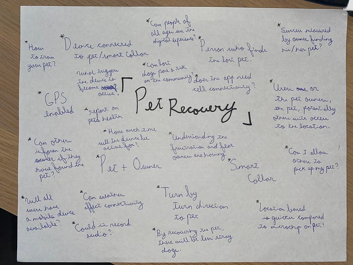
I began by creating a quick mind map of thoughts that came to my mind when thinking of the problem statement.
A crucial question to keep in mind and should be answered early in our research as well is:
Why do pets go missing and how can it be prevented?
I decided to do some research on this and discovered various reasons as to why pets become lost:

What are some options to be done so that this can be avoided?

It’s important we study these questions as it lays some groundwork on what the problem is and what is currently believed to be the solution in order to prevent the problem from occurring in the first place.
I also want to add on the side a thought I had while brainstorming. I began to think, isn’t microchipping the pet the only way to get your pet back? Although microchipping does work most of the time, it relies on someone finding the pet, bringing it to a pet shelter or vet, and only there can they scan the microchip to see who the pet belongs to. This can be a long process and sometimes the pet might not even be microchipped making it impossible at that point to know where the animal came from.
We will make some assumptions about our product:
1. The smart collar is already in existence and our task is to make the experience of the user with the digital device that connects with the collar as seamless as possible.
2. The product is a new release and we do not have any previous knowledge on user expectations. We are not improving upon an existing product.
3. Both the smart collar and the phone are connected to data and have full battery enabling the two systems to interact with one another at all times. (Although I’m making this assumption, it’s important to keep this in mind when designing products and systems which depend on one another. Having full connectivity at all times in a real-world scenario is not possible. Specially for users who do not have active data plans)
Competitive Analysis — Competition & Growth Opportunities.
Competitive analysis is crucial in understanding what is currently available in the market. It’s about understanding their strengths and weaknesses, their success and failures, what customers’ expectations of the products are, how to improve on the unique selling points and overall provides a benchmark against which you can measure your own growth.
Basic research quickly gave me some insight on what is available on the market. There are two primary features of all smart collars. Some models provide GPS technology to monitor the pet’s location. The other type collects metrics from the pet to get insights on physical activity as mentioned earlier in this review.
Going out into the field and testing the apps myself would be the ideal scenario but for one I don’t have the budget to purchase the companion collar, and second, all the applications I found require a yearly subscription to get past the basic functions of the app.
The method I used here was to dive into the app store and find pre-existing apps that claimed to do pet tracking and also paired with a smart collar, followed by taking a look at the reviews left by some users. It’s critical to study both positive and negative reviews as these are strengths and weaknesses posed by products that have already been tested by real users. It can give us great insight as to the direction we could be taking.
I identified three brands who currently have similar features to that which I am looking to explore. We will call these three brands B(brand)1, B2, and B3. I want to explore what its users are saying about the entire system, how they felt about using the product and what they recommended for future improvements.
B1
B1 claims to have GPS tracking to notify where the pet is at all times. It is also possible to set up a geofence to inform the owner when the pet has stepped out of this boundary. The application comes with a smart collar which states it is water resistant and can track daily activity while providing exercise recommendations with a battery that can last for up to 3 months.
You can also add various owners and dog walkers to have access to walk the pet. Various users state the location accuracy is not very precise and doesn’t update as often as claimed. Another user also stated the step tracker for the pet takes up most of the screen and is not a feature they are very interested in. There is a feature which shows public dog ranking and various users have said they are not interested in this feature.
B2
B2 claims to be a very versatile smart collar being able to set goals and track calories burned, distance traveled and minutes active. It also states it can do a health monitoring to catch potential health issues before they become problems. There is also a unique feature which you can send a 30-day summary of all this information to the vet so they can keep a record of your pet’s health.
Reviews online also mention the accuracy of the tracker to not be very good and users mention they wish the app would update the location more frequently. As with B1, users claim they are being notified about activity level without the option to turn this feature off. Looks like users are only interested in the tracking feature as the main function of the app. — This could be fixed by separating the information or creating a separate tab. On a positive note, another user also provided a positive experience stating that it has made him more active by engaging in the pet’s activity monitor as well
B3
B3 calls itself the GPS smart collar for dogs which ‘protects and enhances the bond between dogs and their owners’. It claims you can track your dog’s activity, location, log vet records, use LED light for safety and much more. It can also set activity goals customized to your dog’s age, breed and size.
Reviews claim that there are constant annoying notifications about managing the connection and doesn’t notify the user when the connection has been established with the collar. Another review stated there are no instructions on how the app works or how the features function making it not very user friendly.
Overall, these apps seem to lack the accuracy of the GPS functionality which it claims to have. All these apps also offer fitness activity monitors for the pets, but many users don’t want this feature to be on the main page as they are purchasing the product for the tracker and not so much for the activity information. I also found that the competition lacks in solving the root problem of why pets may need tracking, perhaps the training feature could work. These are great insights and will help us in the design of the application.
User Research & Personas— Understanding the attitude towards the application.
It’s critical to have an understanding of who this product and application is targeted for. Although one wishes that the product covered all user groups and types, its keen to have a clear understanding of who the main users are, become an expert at understanding this group to know what features and uses the application will have, and once this has been achieved, further iterations can be researched to include a wider spectrum of user classes. As mentioned earlier, millennials seem to be tapping into the idea of pet ownership. Research and Markets state, “Those in the 18–30-year-old age group already have the highest likelihood of owning a pet, while 43% of those in this key demographic cohort who do not have a pet now say they want one in the future”. This information is key for understanding how to target the app and how knowledgeable the audience will be when picking up the app.
The next step was to get some participants in this age group and see how they felt about the idea of being able to track their pet. I posed some questions to understand how they felt about the idea of an app that could track their pet’s location.
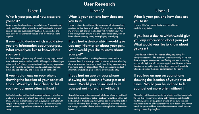
The responses provided great insight into how users felt about an app that would give them their pets location. It’s clear they are very attached to their pets and would not want anything happening to the pet. A user did comment that their pet likes to run away so this feature would be great for tracking the location of the pet. When asked about what type of information they wanted to know about their pet they clearly all stated it would have to be about their health. Two users also stated they would like to know their pet’s location at all times but purely for emergency purposes. I moved ahead with these two features in mind as being the best for the concept.
This led me to build a persona based on the ideal user for this app to focus now on the user’s motivations, goals and challenges when working with the app. This will allow us to make a concrete rather than elastic concept of the user.

When building a persona I like to use the method taught in Artiom Dashinsky’s book ‘Solving Product Design Exercises’ which states that in order to define our goal and define our key user story we can go about using the following statement:
As a <role>, I want <goal/desire> so that <benefit>.
This leads me to create a general idea of what success would look like for a user in our prototype:
As a <pet owner>, I want <to be able to find my pet when they become lost> so that <I have peace of mind that they aresafe and healthy>.
We can relate Maslow’s Hierarchy of Needs in the stage of security and safety needs. Our safety and security becomes the safety and security of the pet, leading to an awareness of control and order in the user’s life.
Solution
Having some knowledge on what our user wants and expects from an app like this, and pairing it with the knowledge we did earlier in our research, I decided that the best option to go about solving our problem statement was to focus on two features. The first is health metrics and second the training aspect of the app. For the first point I understood that in order for the owner to be more aware of the pet’s habits and doings, they would need to know how the pet is feeling. As we learned, providing sufficient exercise and allowing the pet to be entertained throughout the day, is a way to combat boredom in pets therefore aiding and preventing the animal from finding other ways to keep busy and running away. The two methods work hand in hand where training and exercise support the need for some sort of health tracking data. These health metrics would be gathered from the smart collar.
The second feature that I looked into was providing training as a way to prevent pets from running away. Although the map and GPS on the pet is a great solution for knowing where the pet is, we need to go further and solve the problem of pets who act upon their first instincts without having any behavioural or obedience training. By providing the location of the pet we are safe to know its whereabouts, by providing training for the pet, we are helping to stop the problem from happening in the first place.
With these two features of the app helping to solve the problem, the next step was to begin ideating the journey a user would take once they have the app working. What would the steps be?
Journey Map and Task Flow— Understand and map out the process users go through
Next step is to sketch a sample journey a user would take to go about finding their pet. It allows us to visualize what steps and process users go through in order to accomplish their goal, we also explore how the app would respond to user inputs.
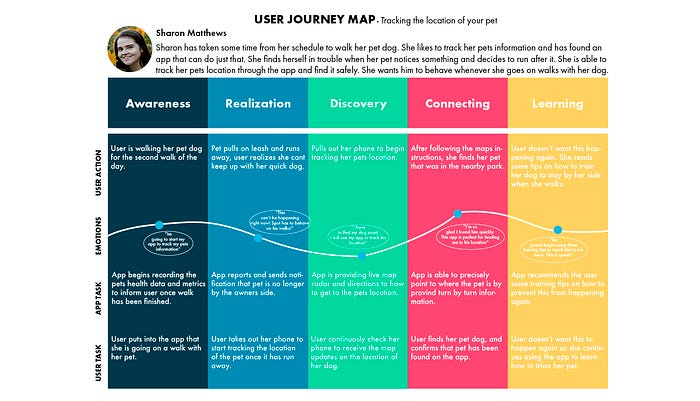
By creating a User Journey, we are able to see touchpoints where the user is interacting with the application, by doing so, we can see where focus needs to be added so that the process goes as smoothly as possible. In this user-flow we can see there is opportunity for the app to be interacting with the user in each and every step of the journey.
The more opportunity we have to interact with the user through various functions in the experience, the more we are able to understand their needs and frustrations leading to closer more personal relationships.

The task flow helps to create a visual guide and paths that the user could take when using the specific function of the app. It allows us to see the interaction between users and the system and understand how they play out. In this task flow, the user begins by activating the app when they are about to go on the walk with the pet and so the app begins to collect health metrics. The user is then tasked to do one of two options at this point. (1) To finish the walk, at which point the app gives a summary of final metrics collected and offers various training for the pet, or (2) Report the pet as lost and the app offers a live map of the pet’s location until the pet is found. User is then prompted to end the walk or continue the walk at which the process begins again.
I think it’s important to highlight that this is only one specific feature for the app which we are solving for our original problem statement. Other features that would need their own research is how to go about offering the pet training, as well as what health metrics are necessary to show to the user and how to go about doing so. It is also dependent on what sensors are available on the smart collar that can send data back to the user.
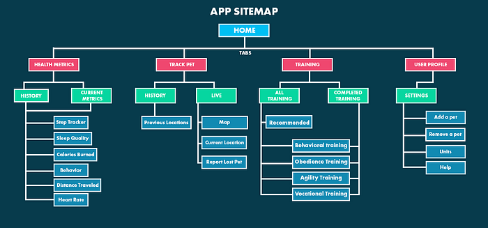
Following what we determined the ideal journey map and task flow are for the scenario, next step is to take those key inputs and turn them into a visual hierarchy to understand the relationships between the different pages in the app.
We had discussed that our users wanted to know health data about their pets but not join it with the tracking map display. So these have been separated into two separate tabs. Earlier on in our research we also learned that one of the reasons pets may run away is because of lack of training, to solve this a tab was added to help users train their pets while at home.
This system works best because the user is constantly able to interact with our application. We are able to provide interactions that support the users throughout the entire experience in hopes of this app becoming the missing link of the connection between the user and the pet. This system provides knowledge for the user about the pet by providing live health metrics and location while looking beyond satisfactory interactions and aiding in training the pet for better relationship between owner and pet which overall creates loyalty and value for the owner.
When analyzing a User Centered approach, a step that I like to do here is to build an experience principle report to help me guide my wireframes and understand what principles my design must follow to design meaningful interactions. These I have grabed from the needs of our persona.
It goes as follows:
Because the pet owner wants to have peace of mind that the pet is safe and healthy -> the experience must be reliable.
Because the pet owner looks to have a well-trained pet -> the experience must be accommodating.
Because the pet owner wants to track her own pets health metrics -> the experience must be trustworthy.
Therefore, what guides the interactions in the experience with the application is reliability, accommodation and trustworthiness in order to target the user’s needs and expectations from the interactions.
Sketches and Wireframes
The wireframes are important in noting down key features required in the final prototype. The previous sitemap had given me a rough idea of how information was going to be organized on the page and what pages were necessary for the concept, I now began sketching to get a visual idea of these screens. Although I give some knowledge on what is included in each screen at this point, take a look further on at the Prototype stage to get a full rundown of each screen.
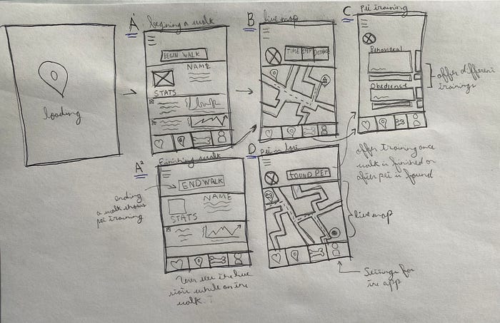
(A) The starting page would be the health metrics screen. I didn’t bog down on the details of what metrics would be included as this would be dependent on the sensors in the smart collar. The user can select to begin or finish a walk depending on the stage of their journey.
(B) The user can click on the Location tab to get a live feed of the location of the pet. They will be alerted when the pet is not at home based on a location the user had previously set.
(C) The Training Tab and screen where users can learn how to train their pets.
(D) The Live Map screen would show when the app has recognized that the pet is not at home or by the user’s location. It will guide the owner to the pet’s location.
Prototype — Seeing it all in action

The app opens on the Health Tab where the user can see data displayed about the pet’s health records. Once here, the owner can select to begin a walk at which point the collar begins recording data about the pet such as number of steps, distance traveled and how many calories have been burned.
The bottom tab has all the options the owner may need. The first is to view the health metrics, the second is to get a live map of the pet, the third is to view the training that can be completed to help in obedience training, and the last option is the settings for whatever may need to be adjusted like adding or removing a pet, adding the home location, or changing units for having a customizable experience for each user.

As the pet and owner begin to go on their walk, the app is collecting data in the background while showing the current location of the pet and owner. I decided not to overcrowd this screen because as we found earlier in our research some users felt that too much information was being displayed without the possibility to turn it off. If the user wants to see the health data they can do so by selecting the “View Health Data” or clicking on the Health tab at the bottom of the screen. This screen shows basic quick information like time and distance traveled.

Once the owner and pet have finished their walk, by going over to the Health tab, an option is available to complete the walk and show a summary of the data collected during the walk. If the walk isn’t complete, the user can simply go back to the location tab and continue viewing the pets location.
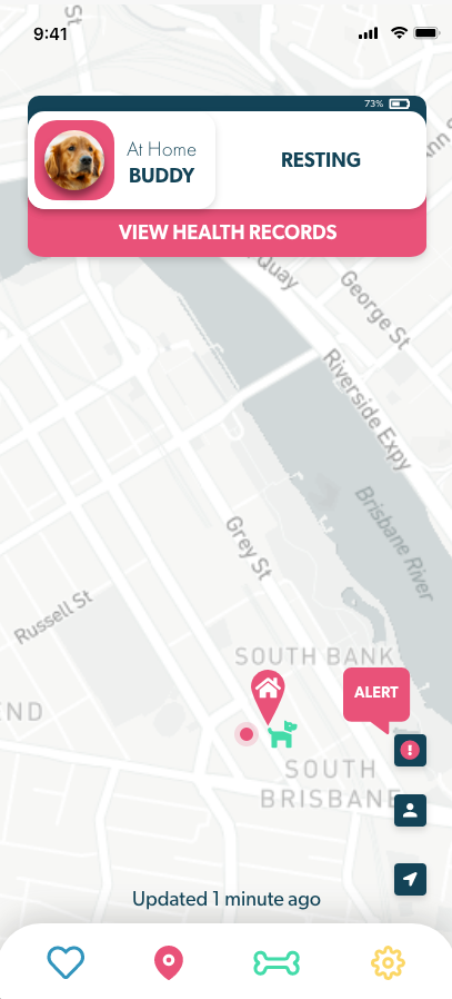
At any point the owner wants to know the pet’s location at that specific time. They can do so by going over to the Location tab and having a look. Here we can see the user has gotten an alert regarding the pets location, clicking it reveals the current state of the pet.
I kept the screens as minimal as possible and only provided the necessary information.

The user is immediately notified that the pet is not home and shows the location of the pet relative to the home, instructions on how to get to the location are provided on the map as well to aid the user in arriving at the fastest time possible. Here the distance is also provided .
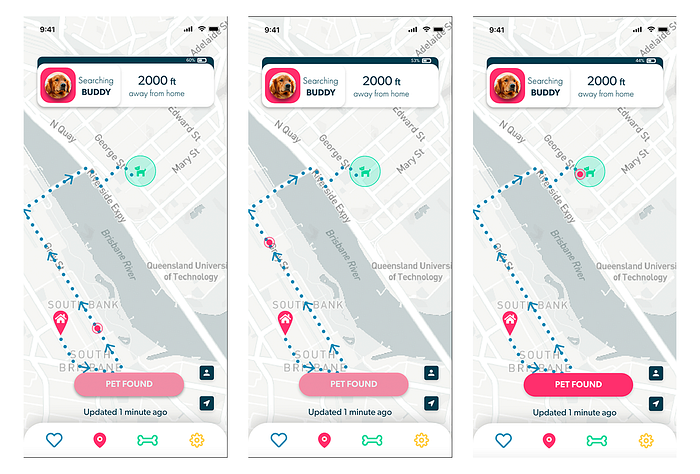
As the user makes their way to the pet, the GPS updates the location of both the owner and the pet. As we can see here, the owner is going towards the location of the pet to pick him up. Once the owner is close enough to the pet, a button to notify the app has been placed that the user activates when they have found the pet. Once the pet is found, is it at this point that we can engage the user in going for some training exercises for the pet. I have disabled the button while the owner and pet are not close to each other to not activate any other option.

When the user presses the button stating that the pet has been found, the next screen that comes up is the Training tab. It encourages follow up to the incident and promotes a safe care for the owner’s pet. This is working towards going beyond satisfactory interactions and provides a meaningful connection between the owner and the app.

The interactive prototype can be seen here:
In Closing
We have solved our problem statement of creating a digital experience which helps to find the pet when it becomes lost by giving accurate GPS location of the pet when it leaves the safe location assigned by the owner or when the pet is separated from the owner when they go on a walk. We also went above and beyond and solved for the root cause of why pets become lost which as research stated was due to insufficient entertainment, boredom and lastly lack of training.
User research was conducted to understand how users feel about the currently existing apps in the market and we discovered some insights that led to our final design. Questions were posed to users who currently have pets to understand how they felt about an app that provided health information and GPS location for their pet and got great feedback which allowed me to create an ideal persona of our typical user type.
Along the way we also defined our users main goals, their desires, and how they would benefit from this application. I defined our three main experience principles which meant our experience had to be reliable , accommodating, and trustworthy in order to align our principles to the users interactions, and this was seen all across the prototype.
Further Thoughts
Although I gave myself a week to work through this challenge, I would have wanted to conduct some user testing to understand fully how a real world user would go about working with this app. This would have given me information on pain points and what could have been improved for version two of the design, as well as challenges the users go through when working through the app.
Although I believe I got some great information from users by posting some questions, I also would have also wanted to spend more time gathering additional information and asking further questions like how would one go about finding their pet prior to building the app, or asked for a situation when their pet came to get lost and how they felt during this situation in order to understand more difficulties users experience in these situations.
If you’re reading this and have been in a similar situation, I’d love to have a chat about your experience and talk over challenges you’ve faced or even features you would like to see in future updates.
Thanks!
